February is bringing about a ton of stories about eco-friendly home design. Natural Home magazine announced that they are building the first ever "green home" in NYC (converting a 90-year-old brownstone in Brooklyn--my late grandmother, who grew up in Brooklyn, would be amused), the Inquirer lead their Home & Design coverage with a story on putting sod on one's roof, while the New York Times is advocating dirt flooring. Did I mention that House and Garden magazine dedicated their February issue to eco-design?
The surge of coverage both highlights the obvious appeal of eco-friendly design (efficient energy bills, decent design quality and general good karma), but doesn't tend to be forthright about the downfalls (products can be prohibatively expensive, time consuming and, in the case of dirt flooring, requires a bit of education before a homeowner is okay with the idea).
Yes, we want to reduce the environmental impacts of our lifestyle without sacrificing style, but generally the costs scare us off. BusinessWeek summed this up nicely. If faced with deciding to purchase a snazzy new granite countertop versus a very efficient furnace, most of us will pick the countertop.
Eco-friendly MIO Culture, based here in Philadelphia, has a bunch of home decor stuff that is a more realistic alternative to sodding up the roofs and floors. As said before, I'm primarily a big fan of their 3-D wallpaper, specifically for long-ignored entry hallways. But the company earns points for their design consideration, but also for addressing affordability.
Showing posts with label Advice. Show all posts
Showing posts with label Advice. Show all posts
Thursday, February 08, 2007
Thursday, January 18, 2007
Adventures in Craigslist Furniture Ads
In the spirit of yesterday's guide to furnishing your first home on the cheap (without loss of style or comfort), I've plunged in to the world of the Philadelphia section of Craigslist to dig up some examples.
Here are this week's great finds, along with tips on updating.
 1. 1890's Sofa Table. This sofa table is a (relative) bargain at $125, looks very sturdy and could be used as a makeshift dining area, bed stand or side table. The leather upholstery (on the table top) seems to be well-weathered and doesn't require any updating. The finish itself isn't terrible, but I would personally spray paint the entire piece in a cream color. Maybe robin's egg blue. As you can see, the beauty of the piece is in the shape of the legs and the general proportion. A solid paint color will highlight those aspects.
 2. Chaise Lounge, $375 A bit pricey for our general purposes (furnishing a home for not a lot of money), but not so bad when you consider that Baker is selling a similar one for $2,000+. I personally find chaise lounges to be entirely necessary to my very being, so if I were so inclined, I'd buy this, then re-upholster in a turquoise or raspberry linen, then painting over the wood in gold, white or black (if with raspberry).
3. 1950's Blonde Oak Dresser, $65 Slightly hotel-esque, but sand down that oily sheen, replace the knobs and paint really any color you wish. I'd advise spray paint specifically made for furniture, available at Home Depot/Lowe's. Could also be used as a sideboard.

Monday, November 27, 2006
Divide and Conquer

As in life, we all might live better with a few boundaries.
Many new construction homes/apartments are of the “loft-inspired” or open floor plan. It’s a no-brainer as to why people like these plans—you get lots of spaciousness, control over where you can arrange your furniture and you don’t have to navigate around doorways when moving in. The issue usually comes up with how to properly define a space when there aren’t any rooms.
I’ve found a solution with the Textile Softwall, available through Design Within Reach (1710 Walnut St.). The Softwall is exactly what it sounds like: a soft wall. It’s made out of environmentally sound materials, portable and soundproof. When standing, the wall’s curvy shape is a more visually interesting alternative to traditional dividers. The Softwall also allows natural light to filter through, no small feat for a partition.
Though it’s a bit pricey for some budgets, I’d say that this was a smart investment for some individuals. You can use it as a general room divider, as a way to section off your home office space, or as an outdoor privacy screen.
Many new construction homes/apartments are of the “loft-inspired” or open floor plan. It’s a no-brainer as to why people like these plans—you get lots of spaciousness, control over where you can arrange your furniture and you don’t have to navigate around doorways when moving in. The issue usually comes up with how to properly define a space when there aren’t any rooms.
I’ve found a solution with the Textile Softwall, available through Design Within Reach (1710 Walnut St.). The Softwall is exactly what it sounds like: a soft wall. It’s made out of environmentally sound materials, portable and soundproof. When standing, the wall’s curvy shape is a more visually interesting alternative to traditional dividers. The Softwall also allows natural light to filter through, no small feat for a partition.
Though it’s a bit pricey for some budgets, I’d say that this was a smart investment for some individuals. You can use it as a general room divider, as a way to section off your home office space, or as an outdoor privacy screen.
Photo from dwr.com
Wednesday, November 15, 2006
Fun on the Table
 Place cards have a very poor reputation-they're the sort of things you see at stuffy little tea parties or dreary dinner parties. I haven't looked back on any of my experiences and said, "You know what would've made Eunice's party so much better? Place cards! That, and not getting my hair caught on fire in the centerpiece."
But if you are a fun individual (and you are if you're reading this), you can make place cards work to your advantage. Start with these fantastic Animal Placecard Holders from west elm (1330 Chestnut St). You probably should buy about four sets at LEAST, since little silver giraffes have a way of going missing. Besides, having lots of placecard holders can be good karma--the more you have, the more fun little gatherings you'll want to have. If everyone had animal-shaped placecard holders, perhaps there would be no such thing as hermits.
Anyway, what can you do after you buy the holders? You can either dutifuly fill cards out with everyone's name, then waste three whole evenings trying to find the right place for your guests. OR you can fill out the cards with the names of splashy/tawdry historical figures, literary characters ("No, I get to be Moll Flanders!") or fun made-up names.
Photo from westelm.com
Monday, November 13, 2006
Much Ado About Antiques
I was positively suckered in to reading an article in the New York Times H&G section last week, merely because the accompanying photographed included Joan Rivers and folk art. Not that I have a particular interest in Joan Rivers and folk art, mind you, I just enjoyed the juxtaposition.
(Here is the article, in case you didn't see)
Well, not only was there scant information about Ms. Rivers and her folk art, the article turned out to be a very serious investigation on what well-heeled people worry most about: What their designers think of their family hand-me-downs and antique purchases.
To wit, "You know these pieces: The baroque, over-size bedroom set, fit for the home of a mountain king; the circular mahogany table that seats 14. Angèle Parlange, who grew up in an 18th-century Louisiana plantation house and is the author of “Creole Thrift,” just published by ReganBooks, calls it “big brown furniture.” And unlike the mistakes you make at a flea market and can unload on eBay, when you take this stuff home, you’re stuck for life."
What a limited and dreary world view to have. I was highly appalled by the glaring lack of imagination that I felt a need to give some soothing tips on what to do with your antiques:
-Paint it gold. Unless Aunt Mimi wrote a brilliant manifesto on her writing desk, feel free to paint it gold, replace the hardware and use it as a mini-bar. Aunt Mimi probably used it in that respect, albeit informally. If you're short on space, take the doors off a closet and place in there. You can always stuff your ill-fitting sweaters and stretched-out bathing suits somewhere else.
-Make a dining room. Even if you have the most microscopic apartment, it will behoove you to make your own dining room. If given the choice between some clunky entertainment center and uncomfortable futons, and a circular mahogany table for 14...you are better off with the table, a deck of cards, and the phone number of the nearest hotel for your dear friends. Throw caution to the wind, when it comes to scale.
-Burn bridges. Some people WILL be cross with you if you start painting "antiques." The resulting grudge will only be short-term, and really, you probably needed a break from their presence/phone conversations anyway.
(Here is the article, in case you didn't see)
Well, not only was there scant information about Ms. Rivers and her folk art, the article turned out to be a very serious investigation on what well-heeled people worry most about: What their designers think of their family hand-me-downs and antique purchases.
To wit, "You know these pieces: The baroque, over-size bedroom set, fit for the home of a mountain king; the circular mahogany table that seats 14. Angèle Parlange, who grew up in an 18th-century Louisiana plantation house and is the author of “Creole Thrift,” just published by ReganBooks, calls it “big brown furniture.” And unlike the mistakes you make at a flea market and can unload on eBay, when you take this stuff home, you’re stuck for life."
What a limited and dreary world view to have. I was highly appalled by the glaring lack of imagination that I felt a need to give some soothing tips on what to do with your antiques:
-Paint it gold. Unless Aunt Mimi wrote a brilliant manifesto on her writing desk, feel free to paint it gold, replace the hardware and use it as a mini-bar. Aunt Mimi probably used it in that respect, albeit informally. If you're short on space, take the doors off a closet and place in there. You can always stuff your ill-fitting sweaters and stretched-out bathing suits somewhere else.
-Make a dining room. Even if you have the most microscopic apartment, it will behoove you to make your own dining room. If given the choice between some clunky entertainment center and uncomfortable futons, and a circular mahogany table for 14...you are better off with the table, a deck of cards, and the phone number of the nearest hotel for your dear friends. Throw caution to the wind, when it comes to scale.
-Burn bridges. Some people WILL be cross with you if you start painting "antiques." The resulting grudge will only be short-term, and really, you probably needed a break from their presence/phone conversations anyway.
Thursday, October 26, 2006
Finding an Alternative to Traditional Crystal Chandeliers
So I got an e-mail today, asking if there were an equally glitzy alternative to a crystal chandelier. The reader had nothing against crystal chandeliers (don't worry, I won't take it personally, just because I would install chandeliers in my refrigerator if I could), but well...we all have our different tastes. That is perfectly understandable. Free to be you and me, that sort of thing.
I was about to recommend entwining christmas lights around a disco ball (kidding), when I thought about the new pendant globe-shaped lighting I've been seeing around town. Round pendant lighting has always either been: a. dust magnets, b. too fussy/small to make a big splash or c. made of flimsy paper.
But now I'm seeing products to the contrary, such as the Schonbek Da Vinci crystal pendant available at Arch Street Lighting (120 Arch St.) and Tom Dixon's Mirrorball pendant at minima (118 N. 3rd). Da Vinci has been making the rounds in the press, mostly because it's the first lamp you can throw in to the dishwasher; but both are equally glitzy alternatives to the stereotypical chandelier. They command a certain strength with mass, which is different to the feeling you get with chandelier tiers or arms.
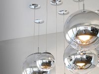
I was about to recommend entwining christmas lights around a disco ball (kidding), when I thought about the new pendant globe-shaped lighting I've been seeing around town. Round pendant lighting has always either been: a. dust magnets, b. too fussy/small to make a big splash or c. made of flimsy paper.
But now I'm seeing products to the contrary, such as the Schonbek Da Vinci crystal pendant available at Arch Street Lighting (120 Arch St.) and Tom Dixon's Mirrorball pendant at minima (118 N. 3rd). Da Vinci has been making the rounds in the press, mostly because it's the first lamp you can throw in to the dishwasher; but both are equally glitzy alternatives to the stereotypical chandelier. They command a certain strength with mass, which is different to the feeling you get with chandelier tiers or arms.

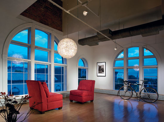
Tom Dixon Mirrorball, left; Schonbek Da Vinci, right.
Photos from minima.us, schonbek.com
Saturday, September 16, 2006
Dining Room Tables Are Very Good Investments
 I've spent a few days trying to find an acceptable desk that has enough surface area for projects, but isn't a dreary eyesore that depresses you to the point of inactivity. Today's desk offerings tend to look as alien to the home as a cubicle or giant Xerox machine would.
I think I've said this before in the not-so-distant-past, but I fully believe and encourage everyone to eschew desks in favor of dining room tables. Yes, even if you have a microscopic apartment (you will come off as imaginative and charming when you throw all the rules regarding furniture scale out the window, by the way).
Here is the logic: Barely acceptable desks tend to cost just as much, and are not nearly as useful as a dining room table. A dining room table can accomodate all sorts of projects, tend to be better constructed and serve as a natural gathering point for your guests. And having a dining room table makes you feel like an interesting specimen that entertains constantly. You also have a place to hang a chandelier, which is always a bonus.
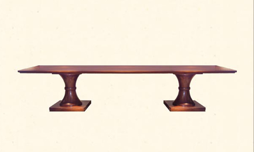
The above dining room table/desk is the Newport Dining Table from Usona Home (113 S. 16th). Made of solid walnut with two pedestal bases, the table is both classic and a bit off-beat. I don't have any particularly imaginative ideas regarding seating, but I do like the idea of this sort of bench seating and their complementary chair counterparts.
(photo from usonahome.com)
Thursday, August 31, 2006
The #1 Decorating Solution For Renters and Other Transients
I have a small spot in my heart for renters. It’s not as big as the spot for Schnapps bears, but one look at that link and it’s obvious why. But I really do sympathize with the plights of renters these days.
First of all, they have to constantly fear that a developer will come in to their building, then convert it in to $500,000+ condos, forcing them in to a seedier part of town. Until the forces of gentrification invade that neighborhood, and so on, until those who can’t afford to buy will be relegated to the Delaware River.
But some renters also have to put up with landlords who won’t allow one speck of color on the walls, producing depressing off-white rooms that marginalize your existence even further. One minute, you feel like a sassy grown-up, the next, you’re looking at the lone pathetic art reproduction poster illuminated by a torchier lamp and wondering what went wrong.
So I was excited when I saw the wall clings, discussed in the previous entry. But once I saw the gentrification-like price of those scraps of vinyl, I got angry. And while I may not be able to fight market forces, I can offer you a solution for your bare walls.
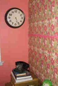
Look at the above left photo (of my office, as indicated by the coffee table books and rotary phone). You’re thinking “Well that sure is a busy wallpaper pattern. Did she steal that from the set of the Mary Tyler Moore show?”
But you're wrong. It's not wallpaper; it's $12 worth of fabric from the local crafts store, with a short length of pom-pom fringe. Underneath all of that color, is roughly 3-4 rolls of double-stick heavy-duty wall mounting tape. Put these items together, rope off about 3 hours of your evening, and your wall can also be enhanced by a little no-damage very cheap faux upholstery. (exhale)
I recommend applying the tape in three foot squares. Place the short end of the fabric length on the horizontal axis of the wall, pressing hard to make sure you get it nice and stuck to the tape. Proceed across the wall. Cover up any unsightly seams with fringe, or ribbon (this is why I advocate working horizontally). Try to use a fabric with a slight stretch to it- here I used a sort of lightweight flannel. The whole project set me back maybe $30. That price won't even get you a packet of wall clings.
NOTE: Obviously...applying zingy fabrics to the wall makes your entire room 10 times more flammable. Be careful with your novelty candles.
Dorm Residents: This is the perfect way to tone down the industrial, soviet bloc-style room you live in. It's also easily removable with a strong tug, in case the pesky RA enters.
Thursday, August 10, 2006
The prescription for a depressing bathroom...
Okay, so you suspect you have a depressing bathroom. I use the term 'suspect' because one can never be too sure of the outlook of an inanimate object. But you just may be depressing yourself and unsuspecting guests, with a regrettable bathroom.
Decor-wise, bathrooms tend to be ignored, even though they're the most visited room in your house when you entertain. In other rooms, you work extra hard to create an inviting environment where people will happily forget where they are. A bathroom, on the other hand, is a constant, usually jarring, jolt back to reality.
In most cases, bathroom depression can be so severe that displaying baskets of even the nicest soaps from Town Home won't be enough to overcome the problem. But you can:
Fix the Lighting: Flourescent lighting is the sartorial equivalent to assaulting your guests. When one gazes at their reflection while under the greenish-hued glow, the party is over for them. You can completely undermine one's confidence with a single flip of the switch. If you own your home, invest in recessed lighting, taking care not to install canisters directly over one's head (such as the center standing area over the sink). Renters (or the installation-phobic) can use indirect sconce lighting for a similarly flattering effect.
Paint the Walls: While a good, bold color can capture my heart, bathrooms really do look better with a low-key color. The most flattering bathroom color I've seen is a buttercream yellow hue- the golden tones enhance skintone while brightening the room.
Invest in a Better Bathtub: And perhaps a sink. But the bathtub tends to be the pivotal piece in a bathroom. You will endlessly impress others with a well-chosen bathtub, since most are, at best, very dreary utilitarian pieces. And you know what you can do with a lovely looking bathtub (like the Savoy from Waterworks)? Fill it with ice and create a mini-bar. It's a batty idea, but doesn't it seem fun? You wouldn't want to do that with most vinyl/chipped ceramic bathtubs.
But if it's not in your budget, a thorough cleaning, a new shower curtain and new hardware can do a world of good.
The big decor retailers in the city- west elm, Williams-Sonoma, Macy's, Ikea- are a good start for bathroom accessories, though the more serious should head directly to Waterworks (1525 Walnut). Their business focuses on bathrooms, so you'll find a good selection of tubs, sinks and hardware.
Okay, so you suspect you have a depressing bathroom. I use the term 'suspect' because one can never be too sure of the outlook of an inanimate object. But you just may be depressing yourself and unsuspecting guests, with a regrettable bathroom.
Decor-wise, bathrooms tend to be ignored, even though they're the most visited room in your house when you entertain. In other rooms, you work extra hard to create an inviting environment where people will happily forget where they are. A bathroom, on the other hand, is a constant, usually jarring, jolt back to reality.
In most cases, bathroom depression can be so severe that displaying baskets of even the nicest soaps from Town Home won't be enough to overcome the problem. But you can:
Fix the Lighting: Flourescent lighting is the sartorial equivalent to assaulting your guests. When one gazes at their reflection while under the greenish-hued glow, the party is over for them. You can completely undermine one's confidence with a single flip of the switch. If you own your home, invest in recessed lighting, taking care not to install canisters directly over one's head (such as the center standing area over the sink). Renters (or the installation-phobic) can use indirect sconce lighting for a similarly flattering effect.
Paint the Walls: While a good, bold color can capture my heart, bathrooms really do look better with a low-key color. The most flattering bathroom color I've seen is a buttercream yellow hue- the golden tones enhance skintone while brightening the room.
Invest in a Better Bathtub: And perhaps a sink. But the bathtub tends to be the pivotal piece in a bathroom. You will endlessly impress others with a well-chosen bathtub, since most are, at best, very dreary utilitarian pieces. And you know what you can do with a lovely looking bathtub (like the Savoy from Waterworks)? Fill it with ice and create a mini-bar. It's a batty idea, but doesn't it seem fun? You wouldn't want to do that with most vinyl/chipped ceramic bathtubs.
But if it's not in your budget, a thorough cleaning, a new shower curtain and new hardware can do a world of good.
The big decor retailers in the city- west elm, Williams-Sonoma, Macy's, Ikea- are a good start for bathroom accessories, though the more serious should head directly to Waterworks (1525 Walnut). Their business focuses on bathrooms, so you'll find a good selection of tubs, sinks and hardware.
Tuesday, August 08, 2006
Giant Clocks for Giant Walls...
The average ceiling height in new construction homes (including condos) is rising. People want the illusion of space that tall walls create, but at the same time, are also frightened at the thought of living with them. Sometimes I think that people only look for high ceilings so they can buy giant christmas trees, but that's another story.
We've talked about using light and paint on big walls in order to get rid of the 'new construction' feeling. But accessories of proper scale are equally important. For example, there is nothing sadder than a massive wall with a normal sized (less than 1' foot diameter) clock. Big wall+Tiny Clock= Depressing apartment.
Twist Home (1134 Pine St) sells a variety of vintage European clock tower faces. They're real vintage, too- all manufactured between 1910-1920's. Though the prices seem high (starting at $2,400), I think you're getting a bargain when you consider the provenance. They'll also work in a smaller apartment, as you can see from the site's photos.
The average ceiling height in new construction homes (including condos) is rising. People want the illusion of space that tall walls create, but at the same time, are also frightened at the thought of living with them. Sometimes I think that people only look for high ceilings so they can buy giant christmas trees, but that's another story.
We've talked about using light and paint on big walls in order to get rid of the 'new construction' feeling. But accessories of proper scale are equally important. For example, there is nothing sadder than a massive wall with a normal sized (less than 1' foot diameter) clock. Big wall+Tiny Clock= Depressing apartment.
Twist Home (1134 Pine St) sells a variety of vintage European clock tower faces. They're real vintage, too- all manufactured between 1910-1920's. Though the prices seem high (starting at $2,400), I think you're getting a bargain when you consider the provenance. They'll also work in a smaller apartment, as you can see from the site's photos.
Thursday, July 20, 2006
Especially for basement dwellers...
...or anyone else living in an indirectly-lit, ultra dreary apartment.
In July's Vogue, I saw a mirrored/metallic-finished bureau that would infuse a dark space with a bit of light and whimsy. And we all know that whimsy is of utmost importance. Remember, you'll never-ever-ever fool someone in to thinking that your 300 square foot shoebox is really a grand penthouse. That just happens to be a basement apartment. You get my point.
But you can fool someone in to thinking that your apartment is a fun-filled space that reflects a bit of personality. And maybe a little light.
So that's where the whimsical metallic furniture comes in. Matthew Izzo carries quite a selection, though you could always spray paint a boring old piece (it took me roughly 3 cans of gold spray paint for a medium-sized desk with drawers). Moderation is key, as if I had to tell you- limit yourself to one metallic piece per residence. Okay, maybe two. But only if they are in different rooms.
P.S: "Gold or Silver?" Normally, I would go with the undertones on this- gold is warm, silver is cold, etc. But some of the silver finishes on the Matthew Izzo pieces appear to be olive-based, so this adds up to a matter of personal style. I'd go with silver if you have a lot of 'modern' boxy type lines, and gold if you have more antiques. For some reason, mixing metallic this way works.
...or anyone else living in an indirectly-lit, ultra dreary apartment.
In July's Vogue, I saw a mirrored/metallic-finished bureau that would infuse a dark space with a bit of light and whimsy. And we all know that whimsy is of utmost importance. Remember, you'll never-ever-ever fool someone in to thinking that your 300 square foot shoebox is really a grand penthouse. That just happens to be a basement apartment. You get my point.
But you can fool someone in to thinking that your apartment is a fun-filled space that reflects a bit of personality. And maybe a little light.
So that's where the whimsical metallic furniture comes in. Matthew Izzo carries quite a selection, though you could always spray paint a boring old piece (it took me roughly 3 cans of gold spray paint for a medium-sized desk with drawers). Moderation is key, as if I had to tell you- limit yourself to one metallic piece per residence. Okay, maybe two. But only if they are in different rooms.
P.S: "Gold or Silver?" Normally, I would go with the undertones on this- gold is warm, silver is cold, etc. But some of the silver finishes on the Matthew Izzo pieces appear to be olive-based, so this adds up to a matter of personal style. I'd go with silver if you have a lot of 'modern' boxy type lines, and gold if you have more antiques. For some reason, mixing metallic this way works.
Friday, July 14, 2006
Saw some neat lighting options at Artemide (232 N. 2nd).
First, there's the Dioscuri wall/ceiling lamp. It works indoors, as well as outdoors. What's keeping it from looking like one of those tragic touch-lights, is that there is minimal contact between the sphere casing and the wall. It appears to float. The scale is a bit small- would look VERY skimpy and sad on its own. Buy multiples, and scatter them all over the wall. Would be a stunning effect on an outdoor wall.
The Logico Ceiling Triple Linear is a very tastefully restrained alternative for those of you who dislike the vintage look of most chandeliers on the market. Instead of relying on straight planes, like most 'modern' chandelier-type fixtures, it relies on the movement of wavy forms and the texture of the glass in order to add that unexpected element to your home. Would work best over a very rectilinear dining room table, perhaps with a high gloss to contrast with the softer form and texture. The reflected light would look best with a ceiling painted in a cool-toned metallic color. Works best with low-to-average height ceilings.
DZ 818, an outdoor light source, brings to mind those old, 19th Century cast iron outdoor lights (maybe it's the way the metal appears, or the curve of the arm). The light is just bright enough to illuminate the front of your home, but not so bright that it attracts moths and unsavory types. Works best for citydwellers, especially those in historic districts with near-identical brick homes. Use two.
And finally, the surf sconce. Many buildings, particularly those in the neoclassical style, use dramatic up-lights to highlight intricate architectural details at night. For those who are currently rushing to buy high-ceilinged apartments, this is the indoor equivalent to outdoor architectural lighting. Because at the end of the day, you're left with all that wall space and nothing to do with it. The right, soft, lighting will make even the most basic molding look grand.
First, there's the Dioscuri wall/ceiling lamp. It works indoors, as well as outdoors. What's keeping it from looking like one of those tragic touch-lights, is that there is minimal contact between the sphere casing and the wall. It appears to float. The scale is a bit small- would look VERY skimpy and sad on its own. Buy multiples, and scatter them all over the wall. Would be a stunning effect on an outdoor wall.
The Logico Ceiling Triple Linear is a very tastefully restrained alternative for those of you who dislike the vintage look of most chandeliers on the market. Instead of relying on straight planes, like most 'modern' chandelier-type fixtures, it relies on the movement of wavy forms and the texture of the glass in order to add that unexpected element to your home. Would work best over a very rectilinear dining room table, perhaps with a high gloss to contrast with the softer form and texture. The reflected light would look best with a ceiling painted in a cool-toned metallic color. Works best with low-to-average height ceilings.
DZ 818, an outdoor light source, brings to mind those old, 19th Century cast iron outdoor lights (maybe it's the way the metal appears, or the curve of the arm). The light is just bright enough to illuminate the front of your home, but not so bright that it attracts moths and unsavory types. Works best for citydwellers, especially those in historic districts with near-identical brick homes. Use two.
And finally, the surf sconce. Many buildings, particularly those in the neoclassical style, use dramatic up-lights to highlight intricate architectural details at night. For those who are currently rushing to buy high-ceilinged apartments, this is the indoor equivalent to outdoor architectural lighting. Because at the end of the day, you're left with all that wall space and nothing to do with it. The right, soft, lighting will make even the most basic molding look grand.
Friday, May 19, 2006
Modular Wallcovering.
One of the biggest trends last year was the InterfaceFlor Modular Carpet Tile System- with good reason, since it eliminated the circle of hell that is measuring for area carpeting. The customizable tiles made perfect sense for renters who wanted to add cheer to their apartments without incurring the wrath of a landlord, pet owners (each tile could be replaced easily) and those of us who can't commit to just one color of carpet.

Philadelphia-based MIO takes the modular concept one step further with their 3D wallcovering system. Each 12"x12" tile, made from recycled materials, is cut to produce a 3D effect. Mix and match the tiles (available in two styles: V2, left; and Flow) to create your own pattern.
Most use the tiles on just one area of a wall, but try tiling an entire room in one color. An entryway/foyer is an excellent place to start- just eliminate extraneous decorative accents. Juxtapose a traditional dining room set with walls covered in white V2 tiles. Keep the lighting low to soften the geometric effect.
One of the biggest trends last year was the InterfaceFlor Modular Carpet Tile System- with good reason, since it eliminated the circle of hell that is measuring for area carpeting. The customizable tiles made perfect sense for renters who wanted to add cheer to their apartments without incurring the wrath of a landlord, pet owners (each tile could be replaced easily) and those of us who can't commit to just one color of carpet.

Philadelphia-based MIO takes the modular concept one step further with their 3D wallcovering system. Each 12"x12" tile, made from recycled materials, is cut to produce a 3D effect. Mix and match the tiles (available in two styles: V2, left; and Flow) to create your own pattern.
Most use the tiles on just one area of a wall, but try tiling an entire room in one color. An entryway/foyer is an excellent place to start- just eliminate extraneous decorative accents. Juxtapose a traditional dining room set with walls covered in white V2 tiles. Keep the lighting low to soften the geometric effect.
Wednesday, May 17, 2006
Eschewing Velvet Ropes, but Keeping Style Intact.
Walking around Old City on Friday night- and I use the verb loosely, as crowds were so thick that I could've easily just allowed myself to be carried off to places unknown- I unofficially retired from going out on weekends in town. As the weather proceeds to get better, more and more people are coming out of their caves to come stand behind the increasing amount of velvet ropes, while wearing frightening amounts of synthetic material (disclosure: saw a girl in an 80's style neon dress, made entirely of nylon. Hope the bar was non-smoking).
Not only that, but it's getting pricier to go out, as the cost of living- and cocktails- steadily rises with rents. Though it pales in comparison to Manhattan, I have my reservations about sitting in an overcrowded faux-Irish pub sipping on an $11 concoction served in a plastic martini glass facsimile.
Unless you can afford to host a casual get-together at The Philadelphia Museum of Art, entertaining at home is the natural, lower-cost choice. Home entertaining is a trend on the rise, not only because of above financial/mental costs, but also because you can easily get all your friends in one place, without hassle.
But the thought of entertaining makes most people anxious. One minute you're planning a menu, the next, you're in near tears over the cleanliness of the bathroom. I say this because I felt the same way- and then I found the Purcell Sisters. Where most entertaining books either get too focused on fantasy (cashmere napkins and 30-year-old Balsamic Vinegar), or etiquette lessons, they constructed their book (Cocktail Parties, Straight Up!) based on entertaining with confidence, i.e. how not to have a melt down while figuring out drink menus. City dwellers themselves, they also take small spaces in to consideration, along with time constraints. A highly recommended read.
Walking around Old City on Friday night- and I use the verb loosely, as crowds were so thick that I could've easily just allowed myself to be carried off to places unknown- I unofficially retired from going out on weekends in town. As the weather proceeds to get better, more and more people are coming out of their caves to come stand behind the increasing amount of velvet ropes, while wearing frightening amounts of synthetic material (disclosure: saw a girl in an 80's style neon dress, made entirely of nylon. Hope the bar was non-smoking).
Not only that, but it's getting pricier to go out, as the cost of living- and cocktails- steadily rises with rents. Though it pales in comparison to Manhattan, I have my reservations about sitting in an overcrowded faux-Irish pub sipping on an $11 concoction served in a plastic martini glass facsimile.
Unless you can afford to host a casual get-together at The Philadelphia Museum of Art, entertaining at home is the natural, lower-cost choice. Home entertaining is a trend on the rise, not only because of above financial/mental costs, but also because you can easily get all your friends in one place, without hassle.
But the thought of entertaining makes most people anxious. One minute you're planning a menu, the next, you're in near tears over the cleanliness of the bathroom. I say this because I felt the same way- and then I found the Purcell Sisters. Where most entertaining books either get too focused on fantasy (cashmere napkins and 30-year-old Balsamic Vinegar), or etiquette lessons, they constructed their book (Cocktail Parties, Straight Up!) based on entertaining with confidence, i.e. how not to have a melt down while figuring out drink menus. City dwellers themselves, they also take small spaces in to consideration, along with time constraints. A highly recommended read.
Thursday, May 04, 2006
Decorating with Candles, without a Grandma result.
I admit that I do have a very small bias against candle-related decor. Just too many of those Yankee candles floating about, I'm afraid. But as the unseasonably warm weather continues with the requisite al fresco dinners, the lure of a well-placed votive candle is hard to resist.
Beeswax vs. Paraffin vs. Soy vs. Everything Else: As the candle market grows exponentially (really, it seems like everyone has a different sort of candle to peddle), manufacturers will surely find a way to make a candle out of dryer lint. Some say that soy candles last longer, while beeswax is more environmentally friendly and then there's that rumor about paraffin generating more soot than in Dickens-era London...well, I say just stick to a basic paraffin candle for an outdoor area. Some people can be quite sensitive to the scent of citronella, and I'm sure that bugs are evolving to be resistant to the smell of it anyway.
How expensive to go: Draw the line between dollar store and Alarmingly Expensive. While a $5 bag of 100 votives seems like a good idea, they are probably filled with air pockets and use a lower-quality wax, leaving you to endless candle replacement duty. A good votive candle should be a bit heavier than you expected, with a slight sheen to the surface (indicating a better quality wax).
Scented or not?: Relegate the scented candles to the bathroom or bedroom. Around food, they tend to numb the palate and might attract bees and mosquitoes.
Make it special: One option is to buy a shaped candle. Personally, I've always felt a bit sad burning these-it's a bit like watching a snowman melt. But if you aren't so sensitive, try a starfish shaped candle, such as this one from Bath & Body Works (17th and Walnut). Place on top of a protective surface, such as a tiny platter (such as the small wood square from West Elm)filled with sea glass, small seashells, sand or smooth pebbles, all of which can be bought at a crafts store.
A charming votive holder is a re-usable option, and keep the breeze from putting out the flame. This starfish tealight holder is similar to the aforementioned candle, and comes from Anthropologie (18th and Walnut). Carrying the oceanic theme are the sea urchin tealights, also from Anthropologie. Buy a few of each size and cluster for an interesting display.
Varying candle height adds dimension to a tablescape. These tulip holders from the Philadelphia Museum of Art come in differing heights and colors. The 24" is a dramatic statement, but might obscure the view of others around the table- keep that particular height to a buffet.
I admit that I do have a very small bias against candle-related decor. Just too many of those Yankee candles floating about, I'm afraid. But as the unseasonably warm weather continues with the requisite al fresco dinners, the lure of a well-placed votive candle is hard to resist.
Beeswax vs. Paraffin vs. Soy vs. Everything Else: As the candle market grows exponentially (really, it seems like everyone has a different sort of candle to peddle), manufacturers will surely find a way to make a candle out of dryer lint. Some say that soy candles last longer, while beeswax is more environmentally friendly and then there's that rumor about paraffin generating more soot than in Dickens-era London...well, I say just stick to a basic paraffin candle for an outdoor area. Some people can be quite sensitive to the scent of citronella, and I'm sure that bugs are evolving to be resistant to the smell of it anyway.
How expensive to go: Draw the line between dollar store and Alarmingly Expensive. While a $5 bag of 100 votives seems like a good idea, they are probably filled with air pockets and use a lower-quality wax, leaving you to endless candle replacement duty. A good votive candle should be a bit heavier than you expected, with a slight sheen to the surface (indicating a better quality wax).
Scented or not?: Relegate the scented candles to the bathroom or bedroom. Around food, they tend to numb the palate and might attract bees and mosquitoes.
Make it special: One option is to buy a shaped candle. Personally, I've always felt a bit sad burning these-it's a bit like watching a snowman melt. But if you aren't so sensitive, try a starfish shaped candle, such as this one from Bath & Body Works (17th and Walnut). Place on top of a protective surface, such as a tiny platter (such as the small wood square from West Elm)filled with sea glass, small seashells, sand or smooth pebbles, all of which can be bought at a crafts store.
A charming votive holder is a re-usable option, and keep the breeze from putting out the flame. This starfish tealight holder is similar to the aforementioned candle, and comes from Anthropologie (18th and Walnut). Carrying the oceanic theme are the sea urchin tealights, also from Anthropologie. Buy a few of each size and cluster for an interesting display.
Varying candle height adds dimension to a tablescape. These tulip holders from the Philadelphia Museum of Art come in differing heights and colors. The 24" is a dramatic statement, but might obscure the view of others around the table- keep that particular height to a buffet.
Monday, May 01, 2006
The Urban Home Office.
In the space-impaired urban nest, the home office area is a relative term. A small percentage of us have the luxury of a designated home office, while the rest of us make do with a disorganized corner of our sofas, or other inconvenient spot. One man's home office is another man's laundry room, after all.
Should you invest in a desk? If you actually work from home, have a demanding hobby, or are a student, then yes. A desk can be an excellent motivator for the procrastination-inclined. Having that specific spot to write your memoirs, study brain surgery or categorize your seed collection will inspire more productivity than the overstuffed Barcalounger dangerously close to a television.
Unfortunately, desks present a conundrum. You either get a spacious work surface, or you get clever storage, rarely both. Pick work area and watch those square inches pile up with clutter. Pick storage and you won't have enough surface room to sign checks. For the serious home worker, it's a better choice to select the "surface area" option, with a few alterations for the clutter-inclined. Start with a sensible desk, such as the B1 desk from Usona Home Furnishings (113 S. 16th), with drawers for the bare essentials: pencils and paper. Keep your address books, legal pads, calligraphy sets, commemorative inkwells and other items in a stool that doubles as storage, such as this Storage Cube from Pottery Barn (4230 Main St., Manayunk; Route 73, Marlton; King of Prussia Mall). For those who require back support, use the cubes as an ottoman, or stow under the desk.
A desk, no matter how well-designed, eats up precious square footage for the casual home worker. A dining room table can easily be re-purposed using a few techniques. First, find a place to keep your materials (pens, files, postage), such as a little-used nook in your china cabinet or on a bookshelf. A basket, such as this magazine holder from online retailer Hold Everything, keeps everything together and is sturdy enough to stand on its own.
For serious filers, make your own Portable Desk (in the spirit of hanging CD storage curtains). Buy a length of vinyl from the fabric store, and a cheap, cheery vinyl tablecloth from a discount retailer- think Target. Cut the vinyl in to varying sizes of rectangles and squares, and apply a strong-hold glue to three sides, producing a pocket. Drape over your table when it's time to work. The Portable Desk is very handy for filing bills and those other loose pieces of paper that tend to run away easily, and also works well as an outdoor desk- just spread the tablecloth on the grass, patio or table.
If you don't have a dining room table, pull up a bar stool (if you don't have one, visit Mr. Bar Stool, at 167 N. 2nd St.) to the counter. Make an office nook by hanging cork tiles, found at any office supply store, on the wall, or on to the refrigerator. If you own, consider adding a coat of chalk board paint to your refrigerator, wall, or cabinet for a writeable surface. Keep supplies in the closest drawer or cabinet.
In the space-impaired urban nest, the home office area is a relative term. A small percentage of us have the luxury of a designated home office, while the rest of us make do with a disorganized corner of our sofas, or other inconvenient spot. One man's home office is another man's laundry room, after all.
Should you invest in a desk? If you actually work from home, have a demanding hobby, or are a student, then yes. A desk can be an excellent motivator for the procrastination-inclined. Having that specific spot to write your memoirs, study brain surgery or categorize your seed collection will inspire more productivity than the overstuffed Barcalounger dangerously close to a television.
Unfortunately, desks present a conundrum. You either get a spacious work surface, or you get clever storage, rarely both. Pick work area and watch those square inches pile up with clutter. Pick storage and you won't have enough surface room to sign checks. For the serious home worker, it's a better choice to select the "surface area" option, with a few alterations for the clutter-inclined. Start with a sensible desk, such as the B1 desk from Usona Home Furnishings (113 S. 16th), with drawers for the bare essentials: pencils and paper. Keep your address books, legal pads, calligraphy sets, commemorative inkwells and other items in a stool that doubles as storage, such as this Storage Cube from Pottery Barn (4230 Main St., Manayunk; Route 73, Marlton; King of Prussia Mall). For those who require back support, use the cubes as an ottoman, or stow under the desk.
A desk, no matter how well-designed, eats up precious square footage for the casual home worker. A dining room table can easily be re-purposed using a few techniques. First, find a place to keep your materials (pens, files, postage), such as a little-used nook in your china cabinet or on a bookshelf. A basket, such as this magazine holder from online retailer Hold Everything, keeps everything together and is sturdy enough to stand on its own.
For serious filers, make your own Portable Desk (in the spirit of hanging CD storage curtains). Buy a length of vinyl from the fabric store, and a cheap, cheery vinyl tablecloth from a discount retailer- think Target. Cut the vinyl in to varying sizes of rectangles and squares, and apply a strong-hold glue to three sides, producing a pocket. Drape over your table when it's time to work. The Portable Desk is very handy for filing bills and those other loose pieces of paper that tend to run away easily, and also works well as an outdoor desk- just spread the tablecloth on the grass, patio or table.
If you don't have a dining room table, pull up a bar stool (if you don't have one, visit Mr. Bar Stool, at 167 N. 2nd St.) to the counter. Make an office nook by hanging cork tiles, found at any office supply store, on the wall, or on to the refrigerator. If you own, consider adding a coat of chalk board paint to your refrigerator, wall, or cabinet for a writeable surface. Keep supplies in the closest drawer or cabinet.
Wednesday, April 26, 2006
Portable Glamour.
Space-conscious furniture has always been the L.L. Bean of the home design world- functional, yes. But pretty, stylish or fashionable? No.
But as our rooms and apartments get smaller while the home entertaining trend grows, the benefits of stackable, stowable or hideable furniture is obvious. So it's with this mindset that I set out to prove that foldability and good design aren't mutually exclusive ideas.
First, the folding chair. Folding chairs make sense because they solve the problem of having to force guests to sprawl out on the floor, and they can be easily be hidden away when not in use. Neiman Marcus (The Plaza at King of Prussia Mall) has an authentic antique folding chair, originally used at opera performances. Its curved lines and woven seat would be best highlighted in a white room.
Next, was Target. They're in a fit of pseudo-ethnic style at Target (Southeast Philadelphia, Cherry Hill, etc.), which gave me the feeling I was at Pier 1, right down to the potpourri. While I believe that style can be had at all price points, I don't see why "affordable" always has to go hand in hand with "Anonymous Eastern Country." The best option was the classic Director's Chair. It will juxtapose nicely in those pricey, library-esque living rooms. Word of warning: Director's Chairs are notoriously wobbly, so lower the gin content in that batch of Tom Collins.
The stackable chair is more abundant and quite often, better designed. The best place in Philadelphia is, hands down, Minima (118 N. 3rd). The Panton chair's curves and color options are cheery, while the Gigi Stacking, .03, and Fpe chairs have aerodynamic sleekness. Studio apartment dwellers take note- these options, especially the Panton chairs, don't look awful when stacked out in the open.
Space-conscious furniture has always been the L.L. Bean of the home design world- functional, yes. But pretty, stylish or fashionable? No.
But as our rooms and apartments get smaller while the home entertaining trend grows, the benefits of stackable, stowable or hideable furniture is obvious. So it's with this mindset that I set out to prove that foldability and good design aren't mutually exclusive ideas.
First, the folding chair. Folding chairs make sense because they solve the problem of having to force guests to sprawl out on the floor, and they can be easily be hidden away when not in use. Neiman Marcus (The Plaza at King of Prussia Mall) has an authentic antique folding chair, originally used at opera performances. Its curved lines and woven seat would be best highlighted in a white room.
Next, was Target. They're in a fit of pseudo-ethnic style at Target (Southeast Philadelphia, Cherry Hill, etc.), which gave me the feeling I was at Pier 1, right down to the potpourri. While I believe that style can be had at all price points, I don't see why "affordable" always has to go hand in hand with "Anonymous Eastern Country." The best option was the classic Director's Chair. It will juxtapose nicely in those pricey, library-esque living rooms. Word of warning: Director's Chairs are notoriously wobbly, so lower the gin content in that batch of Tom Collins.
The stackable chair is more abundant and quite often, better designed. The best place in Philadelphia is, hands down, Minima (118 N. 3rd). The Panton chair's curves and color options are cheery, while the Gigi Stacking, .03, and Fpe chairs have aerodynamic sleekness. Studio apartment dwellers take note- these options, especially the Panton chairs, don't look awful when stacked out in the open.
Tuesday, April 25, 2006
The quest for a better vase.
Most of us own exactly one vase. Perhaps it was an ill-fated wedding gift, or a leftover from Valentine's Days gone by. Wherever it came from, the vase is gathering dust in some undisclosed corner of your house. Which is where it will stay when you finally have a floral arrangement to display.
Moments like that pushed me over the edge, in regards to vases. Not only does it make me anxious trying to determine the right pronunciation, but vases don't seem to be relevant to modern life as we know it, unless your lifestyle dictates the obsessive purchase of fresh blooms. But for most of us, re-purposing other things will do. Besides, it's much more charming and fresh to use something ordinary in an unexpected way.
My favorite non-vase is an empty bottle of fancy booze, particularly Lindeman's Lambic Ale. The wine bottle-like shape is made of a heavy green glass, with an old-fashioned, yet distinctly European label. Use a Lindeman's bottle to display a single daffodill, tulip, or lily. Most larger area liquor stores (like Canal's in Marlton) carry Lindeman's Lambic Ale for around $7.99-8.99.
This isn't going to win me points in the creativity category, but pottery also functions well as a vase (imagine that). Just think of this double-use when trying to justify the cost of a much-needed Jonathan Adler pottery piece.
For those with a minimalistic bent, put something sparse in one of these skinny zombie tumblers from CB2 (which is owned by Crate and Barrel). Group them, single-file, down the length of a rectangular dining room table, or across a mantle.
Domino Magazine suggests using tomato cans, a practice I support, even if I have no use for canned tomatoes in my daily life. It's an adorable look that doesn't appear as if you're trying too hard, and would make a pleasant display along a windowsill. Carnations would look darling. You're not limited to tomato cans, either- I think both the miniature and quart-sized milk cartons, opened as if you were using them, stuffed with flowers, would be very endearing.
Floating just the heads of roses in a teacup is a bit twee, but seems to be popular. I think the way to make this combination more glamorous would be to use plain white teacups, and to group them in a square formation on a low-set coffee table.
Most of us own exactly one vase. Perhaps it was an ill-fated wedding gift, or a leftover from Valentine's Days gone by. Wherever it came from, the vase is gathering dust in some undisclosed corner of your house. Which is where it will stay when you finally have a floral arrangement to display.
Moments like that pushed me over the edge, in regards to vases. Not only does it make me anxious trying to determine the right pronunciation, but vases don't seem to be relevant to modern life as we know it, unless your lifestyle dictates the obsessive purchase of fresh blooms. But for most of us, re-purposing other things will do. Besides, it's much more charming and fresh to use something ordinary in an unexpected way.
My favorite non-vase is an empty bottle of fancy booze, particularly Lindeman's Lambic Ale. The wine bottle-like shape is made of a heavy green glass, with an old-fashioned, yet distinctly European label. Use a Lindeman's bottle to display a single daffodill, tulip, or lily. Most larger area liquor stores (like Canal's in Marlton) carry Lindeman's Lambic Ale for around $7.99-8.99.
This isn't going to win me points in the creativity category, but pottery also functions well as a vase (imagine that). Just think of this double-use when trying to justify the cost of a much-needed Jonathan Adler pottery piece.
For those with a minimalistic bent, put something sparse in one of these skinny zombie tumblers from CB2 (which is owned by Crate and Barrel). Group them, single-file, down the length of a rectangular dining room table, or across a mantle.
Domino Magazine suggests using tomato cans, a practice I support, even if I have no use for canned tomatoes in my daily life. It's an adorable look that doesn't appear as if you're trying too hard, and would make a pleasant display along a windowsill. Carnations would look darling. You're not limited to tomato cans, either- I think both the miniature and quart-sized milk cartons, opened as if you were using them, stuffed with flowers, would be very endearing.
Floating just the heads of roses in a teacup is a bit twee, but seems to be popular. I think the way to make this combination more glamorous would be to use plain white teacups, and to group them in a square formation on a low-set coffee table.
Thursday, April 20, 2006
Mother Mirror.
I must admit that I am extremely mirror-phobic. In this case, it's not a self-esteem problem, but a specific, traumatic incident: A run in with the 1980's.
When I moved in to my present bedroom, there was a half a wall of mirror tiles cemented to the wall. The tiles were immune to even the highest concentrations of goop-remover (it effectively erased 1/8th of my mental capacity, I suspect), and had to be taken off with a hammer and chisel, portions of the wall coming down with it.
Who on earth would do such a thing to their unsuspecting walls?
I suspect its another case of Home Cross-Dressing: Trying to pass off a room, home feature or accessory as Something That It Clearly Isn't. In this case, it's trying to pass off an incredibly tiny room (9x12) as a much bigger one. We've all seen those home tips that encourage you to visually extend a room's parameters by the way of mirrors. When read by a normal person, the urge is to procure a clever decorative mirror, displaying it on a wall of your choice.
When the same article is read by someone who is out of their mind, the urge is to haphazardly glue a series of mirrored tile squares halfway down a random wall. After the damage was done, did the person say, "Well now, it's just like having a huge penthouse! You'd never guess that I resided in a shoebox!"
I don't think so.
Repeat after me: You'll never, ever, EVER be able to pass off a miniscule room as a lofty space. You can mirror yourself in to next week, but the only thing your walls will reflect is the pity on your guests' faces.
But while you can't magically lengthen and widen a room, you can give the appearance of spaciousness with a well-chosen mirror.
The Mist Mirror from Foster's Urban Hardware (124 N. 3rd) begs to be hung in multiples, thanks to the art work-like framing. I'd go with six- 2 rows of three, on the horizontal- in a non-descript hall or foyer. I suppose you could hang these above a sofa, as the caption suggests, but make sure you purchase enough to make an emphatic enough statement. Three small mirrors above a large sofa looks skimpy, not minimalistic.
Placing a larger mirror above a mantel is an ideal thing to do. The somewhat unbroken vertical line that results heightens the ceiling. Try the Raleigh Arch Mirror from Restoration Hardware (4130 Main Street, Manayunk; 300 Route 73, Marlton, NJ). The arch nicely complements the horizontal lines of a mantel and the ceiling line.
In a smallish bedroom, I'm mad for this Venetian Beaded Mirror, also from Restoration Hardware. Since it's tilted, it reflects more of the blank ceiling, giving a hint of spaciousness. Be careful, since this is a major statement piece- keep this on a spare wall (meaning no accessories, and especially no messes), and try your best not to place it directly across from your bed, lest you come off as tawdry. I wouldn't encourage putting it, as the company recommends, in the bathroom, since most of us aren't very amused at such a bold, even if nicely framed, image of ourselves emerging from the bath.
I must admit that I am extremely mirror-phobic. In this case, it's not a self-esteem problem, but a specific, traumatic incident: A run in with the 1980's.
When I moved in to my present bedroom, there was a half a wall of mirror tiles cemented to the wall. The tiles were immune to even the highest concentrations of goop-remover (it effectively erased 1/8th of my mental capacity, I suspect), and had to be taken off with a hammer and chisel, portions of the wall coming down with it.
Who on earth would do such a thing to their unsuspecting walls?
I suspect its another case of Home Cross-Dressing: Trying to pass off a room, home feature or accessory as Something That It Clearly Isn't. In this case, it's trying to pass off an incredibly tiny room (9x12) as a much bigger one. We've all seen those home tips that encourage you to visually extend a room's parameters by the way of mirrors. When read by a normal person, the urge is to procure a clever decorative mirror, displaying it on a wall of your choice.
When the same article is read by someone who is out of their mind, the urge is to haphazardly glue a series of mirrored tile squares halfway down a random wall. After the damage was done, did the person say, "Well now, it's just like having a huge penthouse! You'd never guess that I resided in a shoebox!"
I don't think so.
Repeat after me: You'll never, ever, EVER be able to pass off a miniscule room as a lofty space. You can mirror yourself in to next week, but the only thing your walls will reflect is the pity on your guests' faces.
But while you can't magically lengthen and widen a room, you can give the appearance of spaciousness with a well-chosen mirror.
The Mist Mirror from Foster's Urban Hardware (124 N. 3rd) begs to be hung in multiples, thanks to the art work-like framing. I'd go with six- 2 rows of three, on the horizontal- in a non-descript hall or foyer. I suppose you could hang these above a sofa, as the caption suggests, but make sure you purchase enough to make an emphatic enough statement. Three small mirrors above a large sofa looks skimpy, not minimalistic.
Placing a larger mirror above a mantel is an ideal thing to do. The somewhat unbroken vertical line that results heightens the ceiling. Try the Raleigh Arch Mirror from Restoration Hardware (4130 Main Street, Manayunk; 300 Route 73, Marlton, NJ). The arch nicely complements the horizontal lines of a mantel and the ceiling line.
In a smallish bedroom, I'm mad for this Venetian Beaded Mirror, also from Restoration Hardware. Since it's tilted, it reflects more of the blank ceiling, giving a hint of spaciousness. Be careful, since this is a major statement piece- keep this on a spare wall (meaning no accessories, and especially no messes), and try your best not to place it directly across from your bed, lest you come off as tawdry. I wouldn't encourage putting it, as the company recommends, in the bathroom, since most of us aren't very amused at such a bold, even if nicely framed, image of ourselves emerging from the bath.
Monday, April 17, 2006
Bettie, Bettie, Bettie
There is only one thing I need to say in reference to that Bettie Page bio-pic that's coming out soon to three movie theatres in the area. While Ms. Mol looks adorable in the period outfits, and the plot sounds interesting enough, there is just one thing that I feel the need to say: ENOUGH WITH THE BETTIE PAGE.
There.
Bettie Page is to vintage chic, as Monet is to art: meaning accessible, recognizable to even the lowest common denominator and a very easy reference to "get." There's nothing inherently wrong about Page or Monet, but well...let's just say we need to broaden our minds a bit.
There is a lot more to 1940's and 50's style than Bettie Page. How does this relate to furniture/home decor, you ask? Well, think about it. If you're going to commit yourself to a 40's or 50's style, the first instinct is to go for the Bettie Page look- dark hair with blunt bangs, red lips, leopard. But it's done. You can walk down South Street, or hang out in Northern Liberties, and you will see at least 5 girls with that same look. There's even whole brigades of Page worshippers in the form of those Rollergirl teams. It's not fresh, or new, and involves total commitment to the look in order to not look completely silly (Bettie Page, I suspect, never grocery shopped at Superfresh).
When people are going for a retro-50's look for their homes, they end up buying loads of mid-century-esque stuff from Ikea or West Elm. There's nothing inherently wrong with Ikea or West Elm, either. But the result doesn't read Retro-Chic: It reads "I got all my stuff from Ikea or West Elm. You might want to keep any open flame away from, well, everything."
Mid-Century modern is easy to achieve at all price ranges. At the smaller budgets, leave the references to paint color and lighting: make your walls your furniture. Pick two colors (Tiffany's-box Blue with Cream contrast works), and do a bold, graphic pattern such as polka dots, or vertical stripes. Spend most of your budget on lighting, which can make even the cheapest table look delightful- even when the lighting itself, is cheap. Go geometric, and leave the paper shades behind. The Fado Lamp (no, not named for the irish-themed hookup spot) at Ikea comes in two sizes at the store- buy a handful of each size and arrange in groupings, chandelier-like. Spray-paint all eyesore hand-me-down furniture gold. It's all very Dorothy Draper, preacheress of the maximalist aesthetic and namesake of this very blog.
Those with bigger pockets should head to Mode Moderne specifically for tables and seating, and Matthew Izzo for the Jonathan Adler collection (the couches are much coveted).
But at all price points, keep the Bettie Page rule in mind: don't commit yourself to the safe, easy- to-conjure, look. Mix everything that strikes your eye, don't be afraid to break out the spray-paint and don't concern yourself to the strictly authentic.
There.
Bettie Page is to vintage chic, as Monet is to art: meaning accessible, recognizable to even the lowest common denominator and a very easy reference to "get." There's nothing inherently wrong about Page or Monet, but well...let's just say we need to broaden our minds a bit.
There is a lot more to 1940's and 50's style than Bettie Page. How does this relate to furniture/home decor, you ask? Well, think about it. If you're going to commit yourself to a 40's or 50's style, the first instinct is to go for the Bettie Page look- dark hair with blunt bangs, red lips, leopard. But it's done. You can walk down South Street, or hang out in Northern Liberties, and you will see at least 5 girls with that same look. There's even whole brigades of Page worshippers in the form of those Rollergirl teams. It's not fresh, or new, and involves total commitment to the look in order to not look completely silly (Bettie Page, I suspect, never grocery shopped at Superfresh).
When people are going for a retro-50's look for their homes, they end up buying loads of mid-century-esque stuff from Ikea or West Elm. There's nothing inherently wrong with Ikea or West Elm, either. But the result doesn't read Retro-Chic: It reads "I got all my stuff from Ikea or West Elm. You might want to keep any open flame away from, well, everything."
Mid-Century modern is easy to achieve at all price ranges. At the smaller budgets, leave the references to paint color and lighting: make your walls your furniture. Pick two colors (Tiffany's-box Blue with Cream contrast works), and do a bold, graphic pattern such as polka dots, or vertical stripes. Spend most of your budget on lighting, which can make even the cheapest table look delightful- even when the lighting itself, is cheap. Go geometric, and leave the paper shades behind. The Fado Lamp (no, not named for the irish-themed hookup spot) at Ikea comes in two sizes at the store- buy a handful of each size and arrange in groupings, chandelier-like. Spray-paint all eyesore hand-me-down furniture gold. It's all very Dorothy Draper, preacheress of the maximalist aesthetic and namesake of this very blog.
Those with bigger pockets should head to Mode Moderne specifically for tables and seating, and Matthew Izzo for the Jonathan Adler collection (the couches are much coveted).
But at all price points, keep the Bettie Page rule in mind: don't commit yourself to the safe, easy- to-conjure, look. Mix everything that strikes your eye, don't be afraid to break out the spray-paint and don't concern yourself to the strictly authentic.
Subscribe to:
Posts (Atom)


